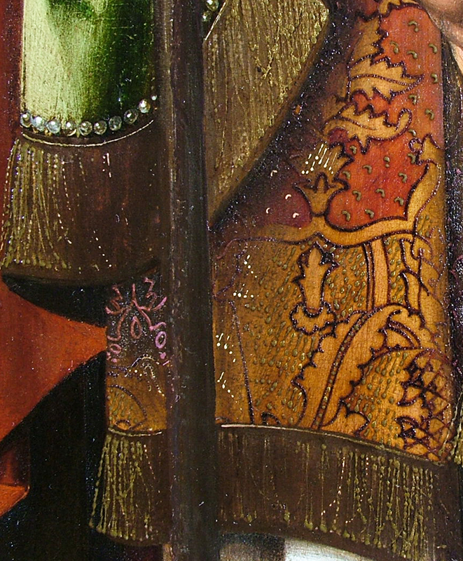
Sumptuous and costly gold-brocaded silk velvets are depicted in most of the paintings by Cornelisz Engebrechtsz (ca. 1462–1527). This article discusses the techniques employed in these brocades–the underdrawing, the build-up of the paint layers, and the patterns–as revealed by technical examination, including close-up photography, tracings, infrared reflectography (IRR), X-radiography, and the analysis of paint samples. The study of the gold-brocaded velvets by Cornelis Engebrechtsz provides detailed information about the specific working methods of this talented colorist and his workshop. While Engebrechtsz’s practice relates to standard fifteenth-century Netherlandish technique, some phases in his painting process deviate from tradition, as the artist gives his gold-brocaded velvets a personal touch.
Gold-brocaded Velvets1
Gold-brocaded silk velvets can be counted among the most luxurious and costly products of fifteenth-century Europe. Although their production was concentrated in Italy, they were exported all over Europe. Prices outside Italy were higher, due to taxes, fees for intermediaries, and transport.2 The cost of this sort of textile varied, but the price for one Florentine braccio (58.4 centimeters) of the most expensive type of gold-brocaded velvet was equivalent to a month-and-a-half of the wages of a fifteenth-century Florentine master builder.3
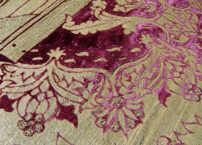
The price of gold-brocaded fabrics depended on several factors in addition to the wages of the many craftsmen involved. The color and the complexity of the velvet – and above all, the type and amount of gold thread woven into the fabric – determined the final price.4 The most expensive velvet was red, made from silk threads that were dyed with kermes.5 Black velvet was also expensive, because it was based on several dyes and was difficult to make lightfast and durable.6 The complexity of the velvet could take several forms. One was the height of the pile; with different heights, one could create an effect like a bas-relief (fig. 1). The weaving of two different heights of pile (alto e basso in Italian) was much more labor intensive than one height, and thus more costly.7 Three heights of pile was the ultimate luxury. Another component of complexity was the number of times the pattern was repeated on the loom. The most expensive textiles had just one repeat over the entire width of the loom, which could vary between 54 and 60 cm.8 The length of the vertical repeat of the pattern could be up to two meters.9 The gold threads with which the velvets were brocaded were probably the most important factor in the price. Different types of gold thread contained different amounts of gold, and, of course, those containing the most gold were the most expensive. Also, the quantity of gold thread woven into the fabric was indicative of the price. Large areas of gold brocade would make a more expensive textile than one that contained small, separate golden motifs. When small loops of gold thread are scattered individually over the velvet pattern, they are called allucciolato. When they are massed together, they are known as bouclé (see fig. 1).10 Obviously, the more areas with alluciolato and bouclé, the more expensive the velvet.
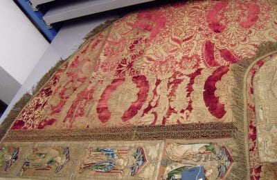
Princely and papal courts were the principal purchasers of these textiles, not only for clothing but also for furnishings. In the fourteenth and fifteenth centuries, the most luxurious of the gold-brocaded velvets were much too expensive for the lower nobility and wealthy citizens to own in large amounts.11 Such individuals did own smaller pieces of luxury textiles in the form of separate sleeves, bodices, gloves or small cushions. Gold-brocaded velvets and other expensive textiles were often donated – either new or second-hand – to the church, where they would be made into vestments and other liturgical items.12 The Museum Catharijneconvent in Utrecht, which houses some of the major church collections from the Netherlands, owns several very fine examples of gold-brocaded velvets. Some of the dalmatics and copes in the collection are clearly pieced together from different sections of gold-brocaded velvet, in various states of wear (fig. 2).
Little is known about the origins of velvet weaving in Western Europe, but certainly during the thirteenth century, plain velvets were woven.13 A century later, there were new developments in design.14 During the first half of the fourteenth century, simple striped or checkered motifs in diverse colors or different heights of pile were woven, while there is evidence of more complex designs, including floral and animal motifs, during the second half of the century.15 These finally developed into the intricate, asymmetrical designs of the fifteenth century.
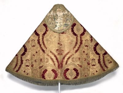
The apex was the so-called pomegranate pattern, which was tremendously popular and continued to be produced until well into the sixteenth century. Its popularity may be partially explained by the multiple meanings of the pomegranate motif: it could stand for majesty, fertility, and immortality.16 The meanings could be combined and could be relevant in both religious and secular contexts. During the fifteenth century, the pomegranate motif was so popular and frequently depicted in paintings that it is hard to tell whether the patron or the painter was alluding to the symbolism of the pomegranate or just striving for an aesthetically pleasing design.17 The term pomegranate is somewhat misleading, for it not only incorporates pomegranate forms but also pinecones, thistles, lotus flowers, palm leaves, and pineapples.18 Basically it involves a large leaflike shape with smaller internal motifs, such as fruit or flowers. The foliate or pomegranate shape can be divided over the fabric in a symmetrical, diagonal repeat that has a static, horizontal appearance or included in the more popular design in which pomegranate shapes are intertwined with branches in an asymmetrical, undulating pattern (fig. 3). These bold, dynamic patterns, with horizontal repeats up to loom width and vertical repeats up to two meters long, were particularly suited to ceremonial and ecclesiastic occasions. The pomegranate pattern is the best known of all Renaissance silk designs today, not least because artists depicted it so often in their paintings.
A Brief Introduction to Cornelis Engebrechtsz
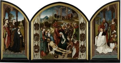
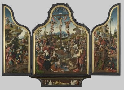
Cornelis Engebrechtsz was born around 1462 and died in 1527. Although we know nothing of his training or his early career, it is certain that around the turn of the century, he had a productive workshop in the city of Leiden. His three sons were trained and worked as assistants in his studio, alongside the well-known artists Lucas van Leyden and his contemporary Aertgen van Leyden, who were also Engebrechtsz’s pupils.19 Even though art historians have noted some Flemish influence in Engebrechtsz’s work, archival sources suggest that from 1497 until his death in 1527, he never left Leiden for more than a few months.20 Although none of Engebrechtsz’s work is signed, three altarpieces by the artist were described by Karel van Mander in his Schilder-boeck (1604).21 Two are still in good condition: the Lamentation and the Crucifixion triptychs (fig. 4 and fig. 5).22 Painted for the wealthy Augustinian convent of Mariënpoel, near Leiden, both were commissioned by Jacob Martensz Schout, rector of the convent between 1508 and 1522. Schout is depicted as the donor on both triptychs.
Only the wings have survived from the third altarpiece mentioned by van Mander: a triptych with the Revelation of Saint John (fig. 6). Today these wings are known by the names of the donors’ families: van der Does and Poelgeest.23 No other paintings attributed to Engebrechtsz are signed nor are they mentioned in contemporary sources. Attributions to the artist are based on stylistic similarities to the aforementioned altarpieces.24
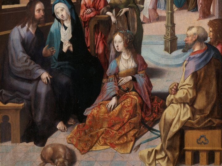
The three altarpieces have been thoroughly examined as part of this study. In addition, some paintings attributed to Engebrechtsz’s workshop have been considered important enough for examination, based on the assumption that models of patterns were used not only by the master himself but also by his workshop assistants. In addition to the altarpieces mentioned above, the following paintings have been included in this study: The Carrying of the Cross,25 Crucifixion,26 The Good Shepherd,27 The Lamentation,28 The Crowning with Thorns,29 Mary Magdalene and Saint John the Baptist,30 and Christ’s Second Visit to the House of Mary and Martha31(fig. 7).
Gold-brocaded Fabrics in Engebrechtsz’s Paintings
The paintings by Cornelis Engebrechtsz, in particular his larger altarpieces, show a wealth of different types of textiles: shot (changeant) silk, diaphanous fabric, velvet, damask, and embroidered and gold-brocaded textiles. Painted textiles – not only in Engebrechtsz’s paintings but also in those of his contemporaries – can be identified by features such as color, pattern, and the sheen of the fabric. Apart from the fabrics mentioned above, which are very distinctive, there are also painted fabrics that are less easy to recognize. For example, whether Saint John’s red cloak in the middle panel of the Lamentation triptych represents wool or linen remains unclear. Gold-brocaded fabrics, on the contrary, are very distinctive, because of the clearly recognizable pattern and the imitation of gold threads. It is important to realize that velvets, which were brocaded with gold, were only a small – albeit the most expensive and sumptuous – part of all gold-brocaded textiles. This article focuses on gold-brocaded velvets only.32
The pattern of the gold-brocaded velvets that Engebrechtsz depicted in his paintings is often a variation on the pomegranate motif with large asymmetrical, undulating repeats. In his designs, he always uses some natural form of flower, leaf, or seed. Geometric shapes, animals, and religious or heraldic devices are never found in his work. As stated in the previous section, pomegranate motifs were the height of fashion at the time. Although Engebrechtsz had no court connections, he might very well have studied gold-brocaded velvets in a religious context. One of his most important clients, the convent at Mariënpoel, was a very wealthy Augustinian order that very likely owned gold-brocaded velvets.33
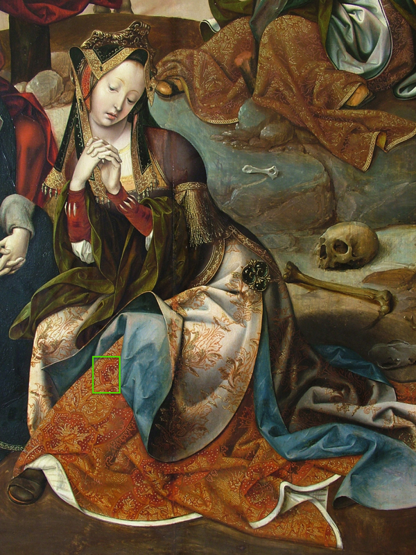
A good example of one of the most sumptuous gold-brocaded velvets – which Engebrechtsz may have seen in real life – is the skirt of the nameless woman in the foreground of the middle panel of the Crucifixion triptych (fig. 8a). The velvet is red, one of the most expensive textile dyes, and has allucciolato scattered throughout the pattern. Remarkably, this is the only known instance where Engebrechtsz depicts two different heights of pile (fig. 8b). Engebrechtsz painted two other types of gold-brocaded velvet: patterns with solid areas of velvet in one height of pile and simpler patterns using single lines of velvet. In keeping with the fact that fabrics with single lines were less luxurious, they were used for less important figures or for the figures in the background. This can be seen in the Crucifixion triptych, where this type of fabric is found on the dress of Mary Magdalene, sitting at the foot of the cross in the background (fig. 9). The manner in which all these types of gold-brocaded velvets were painted, however, was quite comparable.
The First Phase of Paint Layer Build-up: Underdrawing and Underlayers
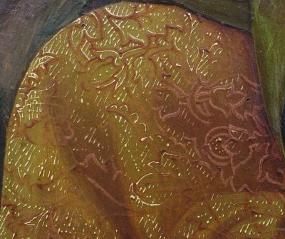
On top of the ground layer, Engebrechtsz applied an underdrawing using a carbon-based material, which is clearly visible when examining the paintings with infrared reflectography. Infrared reflectograms were available for most of the examined works, and they show a very characteristic and detailed manner of underdrawing that uses long flowing lines and rounded hatchings in the shadows.34 For the gold-brocaded velvets, the underdrawing indicates the modeling of the drapery but not the pattern (fig. 10). In all of the studied examples, Engebrechtsz appears to have used a brush and a fluid dark medium to underdraw the draperies for his gold-brocaded velvets.35
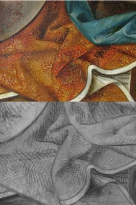
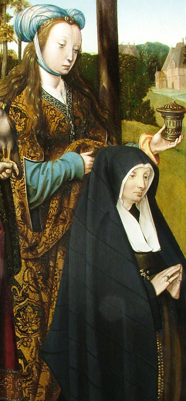
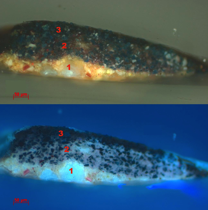
After the application of the underdrawing, the next step in the painting process was the basic modeling of the drapery in paint, which closely followed the underdrawn folds and shadows. For the gold-brocaded fabrics with velvet patterns, the underlayers were executed in a warm orange-brown tone. This color provided the base tone, regardless of the color that would be used to paint the velvet pattern. To the unaided eye, the orange-brown base tone looks as though it was made with a mixture of warm earth pigments. However, examination of several cross-sections of the paint layers showed that it was composed of a mixture of both organic and synthetic pigments, which are not only brighter than earth pigments but also more expensive. The mixture includes an organic red pigment, red lead or vermilion, lead white, and lead-tin yellow.36 Figure 11b shows the underlayer (layer 1) in cross-section (fig. 11a and fig. 11b). The base tone seems to have been painted in relatively thin layers (ca. 30-40 µm). Despite the thinness of the layers, they are relatively opaque; the underdrawing hardly ever shows through as it does in some of the other draperies.37 This is due to the pigments used, which have good hiding power.
In the orange-brown underlayer, Engebrechtsz modeled the drapery wet-in-wet, working from the mid-tone to the lighter areas and the shadows.38 The deepest shadows were often strengthened in a separate layer – and often at a much later stage, after the application of the pattern, discussed in the next section.
The Second Phase of Paint Layer Build-up: Applying the Pattern
The pattern was painted on top of the underlayer. We do not know exactly how the pattern was transferred from the model drawing onto the panel. So far, little technical research has been done on the traditional techniques used to transfer brocade patterns. In 2008, Bart Devolder conducted research on this subject by studying sixteen Netherlandish paintings from the fifteenth century in the National Gallery in Washington.39 He found several possible methods of transfer for the pattern: incised lines or painted or underdrawn lines. On several occasions, however, Devolder found no preparation for the pattern at all. Similarly, no preparation for the pattern was found in the paintings by Engebrechtsz described in this article. There are several possible reasons for this. One is that the pattern was painted freehand. Another is that the artist transferred the pattern using a drawing material that cannot be detected by infrared light, for example, white chalk.40 For the artist, the added advantage of using white chalk is that it becomes transparent and thus disappears when an oil-containing layer is applied over it.41
As mentioned in the previous section, the pattern of gold-brocaded fabrics could consist either of a pattern made up of single lines or a pattern with both lines and solid areas of velvet. In the single-line pattern, the paint was applied in a straightforward manner with two colors; the second color was a lighter version of the main color and was applied locally on top of the main color to imitate the sheen of the velvet. An example can be found in the dress of Mary Magdalene in the middle panel of the Crucifixion triptych (see fig. 8a and fig. 9). On top of the brown underlayer, the reddish lines of the velvet pattern were painted in fairly high relief, almost literally imitating the three-dimensionality of the velvet. The second color – pink – was applied locally on top of the reddish lines.
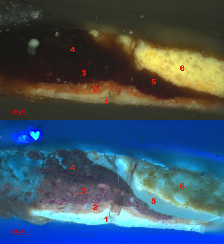
In the dalmatic worn by Saint Martin of Tours on the right interior wing of the Lamentation triptych, the velvet pattern also includes solid areas (fig. 12a). Here, the solid parts of the pattern were first painted with a rather thin, bright red paint. Next the lines and contours were painted in a thicker and darker red. This build-up is confirmed by the paint sample taken from the red velvet pattern of Saint Martin’s dalmatic (fig. 12b). The layer structure is as follows: layers 1 and 2 are the light ground and the orange-brown underlayer.42 Layer 3 is the filling-in of the red pattern and layer 4 (the second red layer) is the thick contour line of the same pattern.43 Layer 3 seems to contain a red organic pigment, mixed with vermilion or red lead. Layer 4 seems to consist of only red organic pigment. In accordance with visual observation, the layers used for the velvet pattern are much thicker than the orange-brown underlayer. In the cross-section these layers are three to five times as thick as the base color.44 The thickness of the paint may be due to the consistency of the red organic paint, but the artist seems to have put this to good use in imitating the three-dimensionality of the velvet pile.
Besides using the relief of the paint itself, the painter also employed another method to imitate velvet: a visual trick whereby he reversed the tonal values of light and dark. In the shadow areas of the drapery, the velvet pattern is light in color, whereas in the areas of the textile that catch the light, the velvet pattern is much darker. This reversal of light and shade in velvet was not invented by Engebrechtsz but can be seen in many Netherlandish paintings from the fifteenth and sixteenth centuries.45 In Engebrechtsz’s paintings, this reversal works surprisingly well on textiles that imitate monochrome velvets. For example, in the dress of Mary Magdalene in the right wing of the van der Does altar, we immediately accept the green fabric as believable velvet (fig. 13). However, in other cases, Engebrechtsz’s attempts to imitate velvet are less convincing, especially in gold-brocaded fabrics. For example, the dalmatic worn by Saint Martin of Tours in the Lamentation triptych shows a much more simplified method of reversing light and shade. On the left side of the figure, where the velvet lies in the deepest shadow, the pattern is painted in a light pink. The contrast with the dark red lines of the rest of the pattern is far too strong and the “system of reversal” is disproportionate (fig. 14). It is difficult to imagine that a painter whom we know to be capable of painting convincing velvets created such a weak imitation in a fabric that is, in all other aspects, very detailed and persuasively rendered.
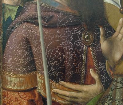
As mentioned above, Engebrechtsz often strengthened the deepest folds of his gold-brocaded drapery after applying the pattern. This is based on visual observation alone: no samples have been taken from these areas. However, there is one very good example where the visual evidence is conclusive and may be indicative for similar cases: the cape on the shoulder of the man on the interior right wing of the Crucifixion triptych, even though technically this textile appears to be a gold-brocaded silk rather than velvet. The cape was painted using underlayers of a burgundy-red color (fig. 15). The pattern has been applied on top of the burgundy in light pinkish – almost white – lines that strongly contrast with the dark underlayers. Over the lines of the pattern, the shadows of the cape were strengthened with a dark red, semitransparent paint. Here the light lines of the pattern are a much darker pink and clearly confirm that the red glaze was applied after the lines of the pattern.
The Third Phase of Paint Layer Build-up: Applying the Highlights
The last phase of the painting process was to imitate the golden sheen of those parts of the fabric that were brocaded with gold thread. This was achieved by applying highlights on the orange-brown underlayer, which was left visible between the pattern elements. For these highlights, Engebrechtsz used yellow and orange-pink touches of paint. The yellow touches imitate the threads of gold in the areas of the drapery which catch the most light, while the orange-pink touches of paint were placed in the deepest folds, where the gloss and sparkle of gold were dulled by the shadows. For the brightest yellow highlights, the artist probably used the pigment lead-tin yellow.46
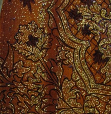
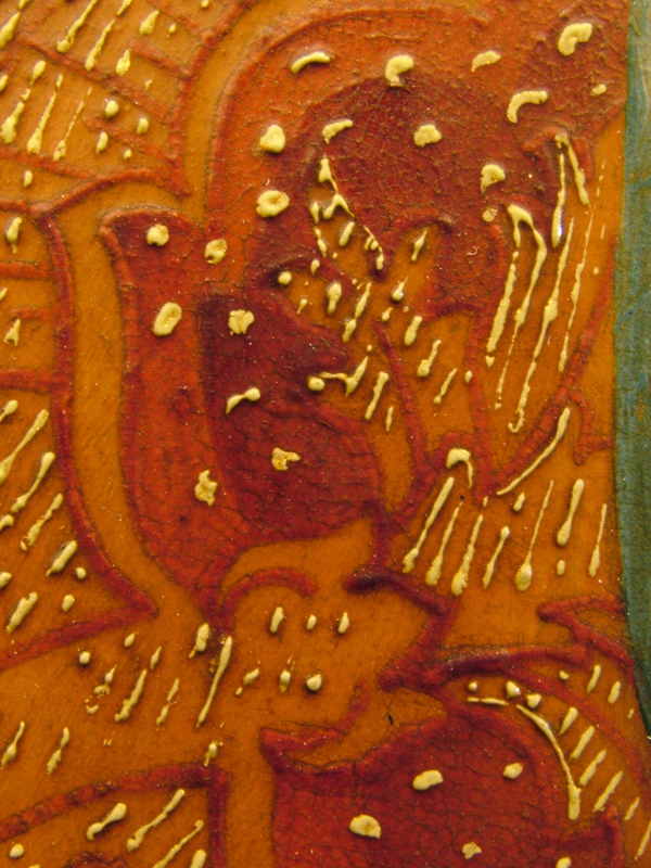
These final touches were applied in small, separate dots and short strokes or lines – never more than a few millimeters long – in high-relief paint. For the most sumptuous gold-brocaded velvets, little comma-shaped touches of paint were placed over the velvet pattern, imitating allucciolato (see fig. 8b). The velvet pattern is sometimes locally accentuated by an uninterrupted yellow contour line. In all of the paintings, the final touches were applied with some space in between the individual lines, leaving the brown layer underneath visible. The general direction of the lines runs at a slight diagonal angle from the top right to the lower left. Other painters in the fifteenth and sixteenth centuries used similar bright yellow highlights in dots, lines, and commas, but their application clearly differs from that of Engebrechtsz. Just as an underdrawing often has a distinct handwriting that can help to identify an artist, so, too, does the application of highlights in brocades.47 Jacob Cornelisz van Oostsanen (ca. 1472–before 1533) is an example of a contemporary artist with a distinct handwriting in the highlights of his gold-brocaded textiles. Figure 16 shows how different van Oostsanen’s more free yellow paint touches are from Engebrechtsz’s well-organized ones (compare fig. 16 with fig. 8b).
In four of Engebrechtsz’s paintings that were studied – the two large Lakenhal triptychs, the smaller fragment with Mary Magdalene and Saint John, and the medium-sized Ghent Lamentation – Engebrechtsz not only applied the yellow paint in a distinctive manner to imitate golden threads, but he also combined paint with actual gilding. This is unusual for the time. During the fifteenth century, beginning in the Southern Netherlands with Jan van Eyck (ca. 1390–1441), gold was eliminated from paintings within a few decades.48 When gold was used in fifteenth-century Netherlandish paintings (including paintings by van Eyck himself), it was often used to depict heavenly light: that is, light for which there is no earthly equivalent, such as halos or the rays of holy light in Annunciation scenes.49 Engebrechtsz depicted a halo only once, and this one is indeed gilded: in the Christ figure in the panel of the Good Shepherd in Rotterdam. No halos or other forms of heavenly light are found in any of the other panels that were studied. Furthermore, none of the other many golden objects depicted – such as the various saints’ attributes (Mary Magdalene’s ointment jar, Martin’s bishop’s staff, Peter’s keys), crowns, jewelry, weaponry and architectural elements – have been gilded. Engebrechtsz clearly had the artistic skill to convincingly use paint in depicting gold. Therefore, it can be assumed that the use of gilding in some of his textiles was a conscious choice, which may of course have been influenced by the wishes of the patron. In this period, the use of gilding in gold-brocaded fabrics is not specific to Engebrechtsz: similar examples have been found in paintings by his contemporaries, Jacob Cornelisz van Oostsanen and Jan Mostaert (ca. 1475–1555), but so far never in paintings by artists from the Southern Netherlands. It may very well be that this was a technique typical of the Northern Netherlands during the first half of the sixteenth century.50
As far as we can tell based on visual observation, mordant gilding was used for the highlights in the gold-brocaded fabrics.51 Engebrechtsz applied the mordant needed to adhere the gold leaf to the surface in medium-high relief, somewhat lower and in a more liquid form than the painted yellow highlights. This is clearly visible when looking at these areas in raking light. The application of the touches of mordant is very similar to the touches of yellow and orange-pink paint in adjacent areas: both have the same “handwriting” of short lines, dots, and commas, again in a relatively open structure. The mordant, however, was more fluid during application than the yellow paint. It has run more and therefore has a flatter appearance (fig. 17). The gilding never overlaps but is always separate from the yellow highlights.
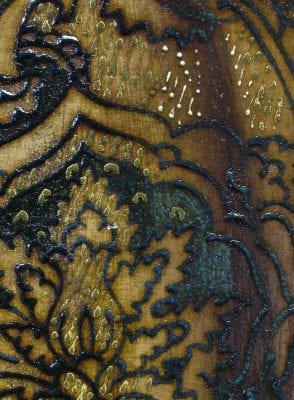
The mordant gilding is usually located in the areas of gold-brocaded velvet that would catch most of the light. Unfortunately, in all four paintings, most of the gilding has now been lost due to abrasion, so that the original effect of the glistening and shimmering gold – which would have been even more pronounced in the flickering light of candle flames – has been completely lost. There is a visible difference in the mordants used in different paintings. In the Lamentation triptych, Engebrechtsz used a dark grayish-green mordant as a base for the gilding.52 Because the gilding has become abraded, the dark, mud-colored mordant is now visible in the lightest areas of the brocaded textile, distorting its appearance (see fig. 17). The imitation of the golden sheen of the fabric is no longer convincing; on the contrary, the effect of the now-visible dark mordant lines is opposite to the effect that was originally intended.
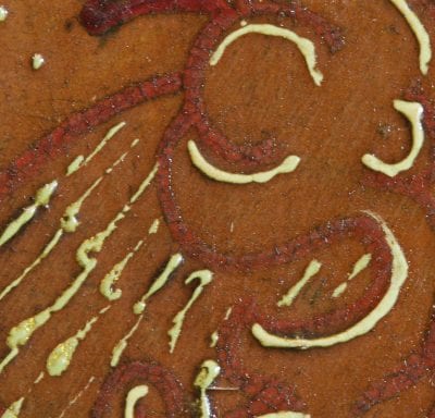
Remarkably, about ten years after adopting the mud-colored mordant, Engebrechtsz used a light yellow mordant for the gilding on the Crucifixion triptych. Here, in spite of the abrasion and loss of the gilding in most areas, the imitation of the gold in the painted fabric is still convincing: the yellow lines of the mordant visually replace the gilding (fig. 18, see also fig. 8b). It is not unusual for artists to vary the color of the mordant to affect the tone of the overlying gold.53 It is, of course, also possible that Engebrechtsz already saw some form of abrasion in his older paintings with the dark mordant and decided to change the color of the mordant to yellow.54
The Patterns Used in Engebrechtsz’s Workshop
While examining the layer build-up of Engebrechtsz’s brocaded fabrics, some additional questions arose regarding the form and technical aspects of the patterns used by the artist. One question was whether the patterns were applied flatly or foreshortened – that is, whether the pattern of the brocade bears any relation to the draping and folding of the fabric beneath it. Looking back to the fifteenth century, it seems that Jan van Eyck was the first to depict gold-brocaded velvets realistically.55 His gold-brocaded velvets are highly illusionistic, including the foreshortening of the pattern over the folds of the drapery. The best example may be the cope worn by Saint Donatian of Reims in the painting Madonna with Canon Joris van der Paele. Unlike most painters, Jan van Eyck was able to study an abundance of gold-brocaded textiles at first-hand, as he was court painter to Duke Philip the Good of Burgundy. Painters after van Eyck became more efficient in rendering gold-brocaded velvets and introduced more schematic working methods.56 This does not necessarily mean that gold-brocaded velvets after van Eyck became less convincing.57 The Master of Frankfurt’s (1460–ca. 1533) method of painting gold-brocaded velvets provides an impressive example of schematization and efficiency, for the artist used only three patterns for the whole of his known oeuvre (ca. 120 paintings). The three patterns have the same dimensions of all of his paintings and were applied flatly; that is, the patterns do not conform to the folds of the fabric.58
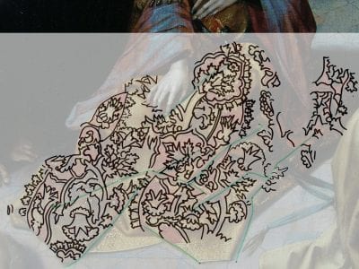
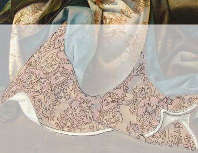
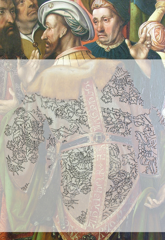
In order to study the patterns used by Engebrechtsz, tracings were made on transparent sheets of plastic laid on the paint surface.59 A fine black marker with a soft tip was used to trace the patterns onto the plastic. The tracings render the pattern in simplified form, without the interference of color or folds. The tracings of different patterns could also be overlaid to make one-to-one comparisons. As a result, it became clear that Engebrechtsz’s patterns were applied flatly, not foreshortened. However, to give his flat patterns the illusion of volume, Engebrechtsz shifted them over the larger folds of the drapery. In this manner he divided the flat pattern into parts, as can clearly be seen in the dress of Mary Magdalene in Christ’s Second Visit to the House of Mary and Martha. In the tracing of this pattern, the folds are indicated by green lines (fig. 19). Dividing and shifting was not always necessary. In the skirt of the woman in the foreground of the Crucifixion triptych, the pattern was applied to be completely flat, without any shifting over folds (fig. 20). Reinforcing the folds of the drapery over the painted pattern was enough to create a convincing image.
Another question that came up during this study was how Engebrechtsz acquired the patterns that he used for his paintings, presuming he did not have real gold-brocaded velvets available in his studio. It is commonly accepted – and confirmed by this research – that the more schematically applied brocade patterns derive from model drawings or model books that artists kept in their studios.60 In this way, a pattern could be used and reused repeatedly, a process that has already been studied in the case of the Master of Frankfurt.61 The manner in which Engebrechtsz came by his patterns or model drawings remains uncertain. He may have made them himself at the beginning of his career; for example, by copying the patterns of church vestments. Another possibility is that he used preexisting pattern drawings, such as sheets that he brought with him from the (unknown) master under whom he was trained or which he bought.62
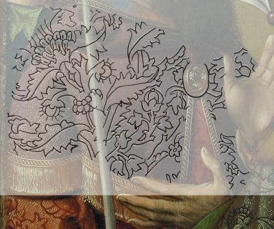
By studying the tracings, interesting information was obtained regarding the use and reuse of patterns in Engebrechtsz’s studio. Most of the patterns – or rather, parts of them – were clearly used more than once. This was done in a sophisticated manner. The reuse of the patterns is difficult to distinguish just by looking at the paintings; one of the reasons for this is that different parts of a basic pattern were used for different gold-brocaded textiles. Of the twenty-three patterns studied, a total of ten basic patterns were found.63 Nine patterns were of the pomegranate type (see fig. 20). The tenth pattern is not a typical pomegranate but a complex pattern of interlocking branches and numerous smaller details such as palm leaves, flowers, bulbs, and pinecones. This pattern is used in Mary Magdalene’s dress in the middle panel of the Crucifixion triptych, in the tunic of the man seen from the back on the right wing of the same altarpiece, and in the burgundy cape of the man next to him, on the far left (fig. 21 and fig. 22).
As just mentioned, some patterns were reused. Five of the ten basic patterns were repeated more than once, one was used twice,64 two patterns were used three times,65 one pattern was used four times,66 and one pattern was even used five times.67 These five patterns link all of the studied paintings by Engebrechtsz with each other, with one exception.68 Some patterns have been found both in the three triptychs mentioned by van Mander as well as in other works that are attributed to Engebrechtsz and his workshop on stylistic grounds. The results of this research thus help confirm these attributions.
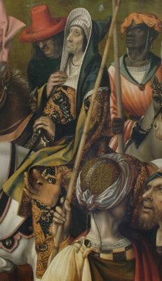
The fact that Engebrechtsz repeated his patterns does not necessarily mean that the artist followed a prescribed manner of execution. On the contrary, he was very inventive in introducing variation in the patterns: he would vary the size, color, and degree of detail. The most frequently used color is red (to imitate the expensive kermes dye), but he would also use black (for example, for the man on horseback in the Crucifixion triptych) and blue (for the dress of Mary Magdalene on the left interior wing of the Lamentation triptych)69 (fig. 23 and fig. 11a). Interestingly, the same basic pattern was used for both these examples, but the resulting costume looks different in each case. Another instance where Engebrechtsz significantly modified the type and color of the depicted fabric is the complex pattern of interlocking branches described earlier in this section. This pattern was used only in the Crucifixion triptych, possibly at the request of the client. In the dress of Mary Magdalene in the middle panel, the pattern was applied in red-brown lines over a gold-brocaded base (see fig. 9). It was painted in light pinkish lines over a burgundy-red base in the cape of the man on the far left of the right interior wing (see fig. 21) and again in black lines over a gold-brocaded brownish-gray base in the tunic of the man seen from the back on the right interior wing (see fig. 22). Even though the two men on the right wing are standing next to each other, the types of fabric depicted are so different in appearance that it is difficult to see that they were made using the same pattern.
Engebrechtsz did not use his patterns in one standard size: he considered the actual size of the figure wearing the gold-brocaded fabric and matched the pattern accordingly.70 The artist used the same pattern for the skirt of the anonymous woman in the foreground of the middle panel of the Crucifixion triptych and the dress of Mary Magdalene in Christ’s Second Visit to the House of Mary and Martha. In the dress of Mary Magdalene, the pattern is about half the size of that in the skirt of the anonymous woman (see fig. 19 and fig. 20). In both cases, the relationship between the proportions of the basic pomegranate motif and the faces of the figures is the same. The pattern was used a third time on the dress of Saint Catharine in the small Crucifixion triptych from the Rijksmuseum (fig. 24). In this case, however, the basic pomegranate element is disproportionally larger than the head of the figure. Engebrechtsz was somewhat limited by the size of this figure; he probably wanted his gold-brocaded fabric and pattern to remain recognizable.
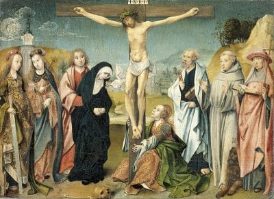
Engebrechtsz not only varied the size of his patterns, he also varied the amount of detail. The more prominent the pattern, the more detail it was given: for example, the use of allucciolato and solid velvet as opposed to simple lines of a pattern. In the skirt of the anonymous woman on the Crucifixion triptych and in the dress of Mary Magdalene in Christ’s Second Visit to the House of Mary and Martha, the pomegranate patterns are painted as solids, whereas the same pattern in the dress of Saint Catharine consists only of lines. The largest version of the pattern even has two heights of pile. As mentioned before, this is the only known example in Engebrechtsz’s oeuvre where he depicts more than one height of velvet pile. It is also one on the largest gold-brocaded velvet patterns that he ever painted.
In the Northern Netherlands, Cornelis Engebrechtsz was one of the last painters to use gold-brocaded velvets in such abundance in his work. His famous pupil Lucas van Leyden abandoned the depiction of these luxury textiles in his paintings altogether.71 By the end of the sixteenth century and during the seventeenth century, gold-brocaded velvets would still be used occasionally, but far less often than in the fifteenth and early sixteenth century. Whereas gold-brocaded velvets in fifteenth-century paintings related to contemporary fashion, gold-brocaded velvets in seventeenth-century paintings referred to a “historical” textile. Correspondingly, during the sixteenth century, gold-brocaded velvets became easier to obtain (though still only by the wealthy). During the seventeenth century, it was even possible for successful painters like Rembrandt and Van Dyck to own a piece of gold-brocaded velvet as a studio prop.72
Conclusion
The paintings by Cornelis Engebrechtsz and his workshop stand at the end of a long tradition of depicting gold-brocaded velvets. Van Eyck was one of the first to realistically depict gold-brocaded velvets using paint only; and in following years of the fifteenth century, the depiction of these fabrics became tremendously popular. Painters imitated gold-brocaded velvets with varying degrees of proficiency, although there was a general tendency toward the use of more efficient methods in rendering these textiles, leading in some cases to rather static depictions. Although the gold-brocaded velvets depicted in Engebrechtsz’s paintings have a certain degree of schematization and lack the persuasiveness of those of van Eyck, the artist’s manner of executing these luxury textiles is still quite distinctive.
Engebrechtsz combined a practical and efficient working method with a refined mastery of his materials. In the build-up of his paint layers, he followed the tradition of his fifteenth-century predecessors in applying a warm brown underlayer over the underdrawing of the drapery. This first paint layer functioned as a base tone for the brocade pattern, which was applied on top of it. Engebrechtsz reused his brocade patterns in different works from two up to five times. In total, ten basic patterns were identified and were found to vary in size according to the height of the figures. In comparison, the Master of Frankfurt, his contemporary, used three basic patterns in one size only. Although the patterns were applied flatly, Engebrechtsz created a convincing sense of volume by shifting the pattern over the main drapery folds and by strengthening the shadows of the drapery on top of the pattern. He imitated visual effects that occur in actual velvets by manipulating the relief of the paint to depict different heights of pile and by reversing light and shade. To reproduce the golden sheen of the threads, Engebrechtsz applied final touches of paint in yellow and orange-pink in an idiosyncratic handwriting. He sometimes also used mordant gilding for the highlights, a dark greenish mordant in the Lamentation triptych and a bright yellow mordant in the Crucifixion triptych. Remarkably, although the use of actual gilding in gold-brocaded fabrics is unusual in the works of Southern Netherlandish painters and their fifteenth-century predecessors, it is also found in paintings by a contemporary of Engebrechtsz, Jacob Cornelisz van Oostsanen.
None of the painting techniques that Cornelis Engebrechtsz employed are unique; however, the way he used and combined techniques characterizes his distinct manner of working. In addition, the selection and reuse of certain patterns clearly link the studied works to the workshop of the master and can help in placing doubtful attributions. By focusing on the techniques and patterns of painted gold-brocaded fabrics, this study contributes to the body of knowledge about the studio practice of one early sixteenth-century Northern Netherlandish artist. Further research on the painting techniques of gold-brocaded velvets in the works of other fifteenth-century Northern Netherlandish painters such as Albrecht Ouwater and Geertgen tot St. Jans will give this study a broader context.73
